The colourful letters of the Google logo have changed their look again, but this time it’s permanent. We look at what’s changed, and why. Does the simplified look bring a sense of freshness and futurism, or is it merely juvenile?
Judging on first impressions
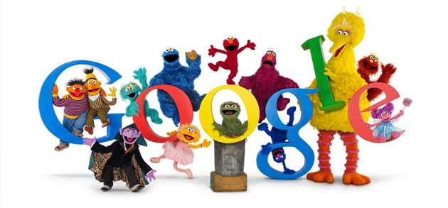
My first thought upon seeing the new typeface was how much it looked like Sesame Street: “Today’s logo is brought to you by the letter G”. Other designers and commentators agree that the choice of typeface is reminiscent of alphabet fridge magnets and children’s picture books.
This is no accident. The new logo makes perfect sense with Google becoming a subsidiary of the newly-formed Alphabet Inc. Paring back their typeface to the simplest construction of each letter (with just a little nudge on the E for style’s sake) is a clever choice for a company called Alphabet.
Back to Basics
What do I mean by paring back the letters? You probably already know about the difference between serif and sans-serif typefaces. Serifs are the little “feet” on the letters that help to emphasise horizontal lines on a page. They are traditionally associated with printed text, based on the almost-true argument that they help the eye to follow each line quickly.
Sans-serif typefaces don’t waste time with such embellishments – the goal is for neat and clean letters. Most people agree that sans-serif characters are easier to read on a screen, which is why they are used on just about every webpage in existence. They also tend to be the choice for depictions of futuristic worlds.
But Google’s new logo doesn’t just remove the serifs – it distils each letter to its very essence. That essence? Circle and straight lines.
Have you ever noticed that it’s possible to draw every lower-case letter in the English alphabet with just four shapes? Everything from A to Z can be formed from a combination of circles, semicircles, and long and short lines. Indeed, in the British and American education systems, five year olds learn handwriting based on these four shapes.
That’s why the super-simple new logo for Google and Alphabet Inc is so clever. It’s also why it’s no surprise that the new look conjures up feelings of coloured plastic magnets and puppet-based edu-tainment.
Simpler logo for a digital age
Google has said that their primary reason for the update was to make the logo suitable across a range of screens. They wanted a logo that would be equally clear on a 32-inch HD desktop monitor and on a sleek smart watch. This is wise thinking, and something all businesses should consider when designing their brand.
It’s not just about the look, either. The new logo, being so much simpler in design, actually shrinks the size of the image file. This isn’t essential for most businesses in the practical day-to-day world (so long as images are kept at a reasonable size on the web). Nevertheless, for my fellow designers out there, it’s fascinating to consider that Google claims the new logo can be optimised to a miniscule 305 bytes! (The old one was around 2Kb when compressed.)
Trading wisdom for accessibility?
The argument that is bound to rage over the coming months will be whether or not this new logo “works”.
When a business alters their visual branding, there’s usually a backlash from customers. The majority of complaints stem from the simple fact that people just don’t like change.
But Google has a track record of creatively adapting their logo via Google Doodles every few weeks. This should help people feel more comfortable with the sudden change of design. In fact, I’d even expect that there’s a huge proportion of Google searchers out there who haven’t yet realised that the change is permanent this time.
One of the complaints already surfacing is that the super-simple look loses the scholarly feel of the old logo. It’s hard to reconcile the basic primary-school letter shapes with Google’s reputation as the world’s premier source of knowledge.
The new typeface is clearly accessible to small children. Google also believes that this graphic will display quickly and cleanly on all types and sizes of screen. We can only hope that this new accessibility doesn’t come at the cost of Google’s authoritative voice.
G is for Google
Google is stepping into a new age. The new, clean logo speaks to the futuristic side of the business. The simplicity welcomes the brand into every corner of life, and into the hands of even the youngest users.
For a time, the unsophisticated shapes will not doubt seem jarring and tacky, but this will pass. How can it not, when so many of us will be seeing the new rainbow G icon so many times each day?
Back in 2009, Google helped celebrate the 40th anniversary of Sesame Street with a special range of Google Doodles. Perhaps in 2015 we’ll see Sesame Street return the favour with their own cross-promotion?
I expect it’s only a matter of time before the muppets start teaching preschoolers the ins and outs of Google’s range of products. To borrow from the famous words of a particular cookie-loving monster, “G is for Google – that’s good enough for me!”


