
by Tim Halling | Sep 21, 2015 | Design
You’ve probably been told that people hate change. Recently, music streaming service Spotify proved the axiom by making a minor alteration to their branding. The backlash on social media was surprisingly volatile, taking the organisation by surprise. What is the...
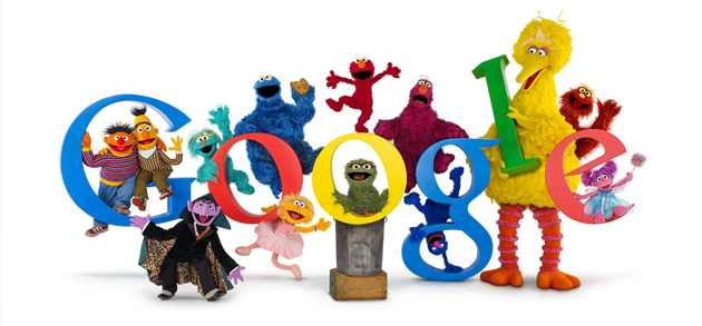
by Tim Halling | Sep 6, 2015 | Design
The colourful letters of the Google logo have changed their look again, but this time it’s permanent. We look at what’s changed, and why. Does the simplified look bring a sense of freshness and futurism, or is it merely juvenile? Judging on first impressions My...
Recent Comments